
Design Objective
The goal of this project was to create a revitalized marketing identity for the Greenville Zoo, a small attraction near downtown Greenville, SC. With declining membership and limited public engagement, the zoo aimed to rebrand ahead of a Fall 2025 relaunch supported by a multi-million dollar grant. The project involved research, visual exploration, and the development of a new logotype, color palette, style guide, and signage system to increase visibility and strengthen its appeal to families and downtown visitors.

Design Brief
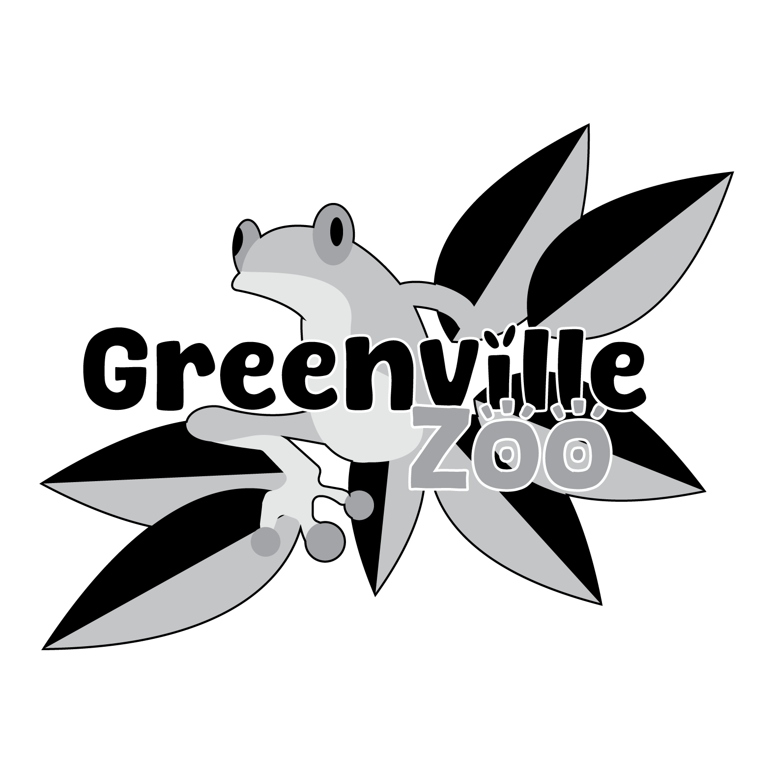
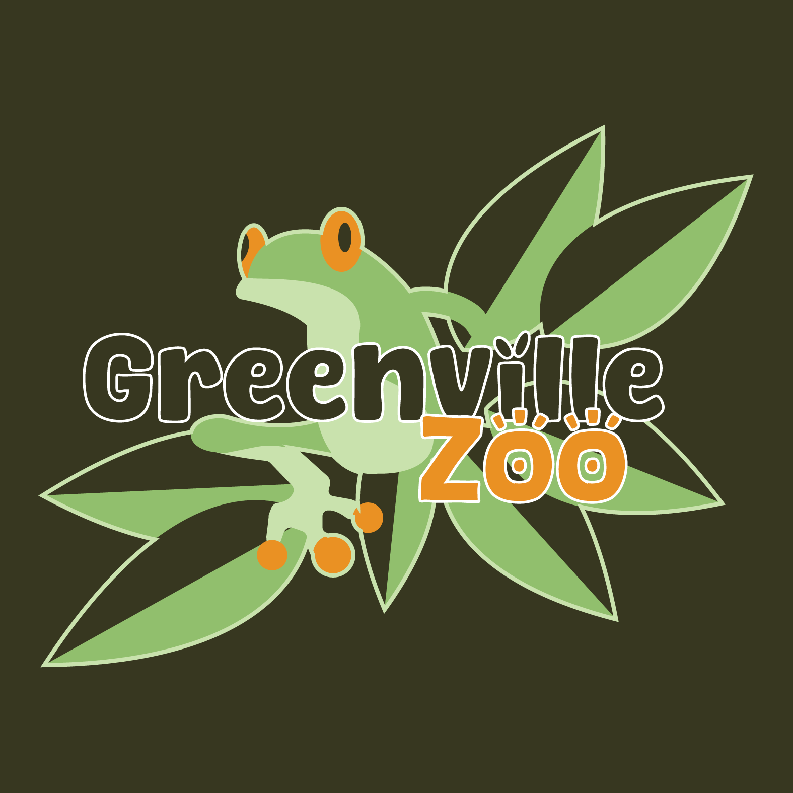
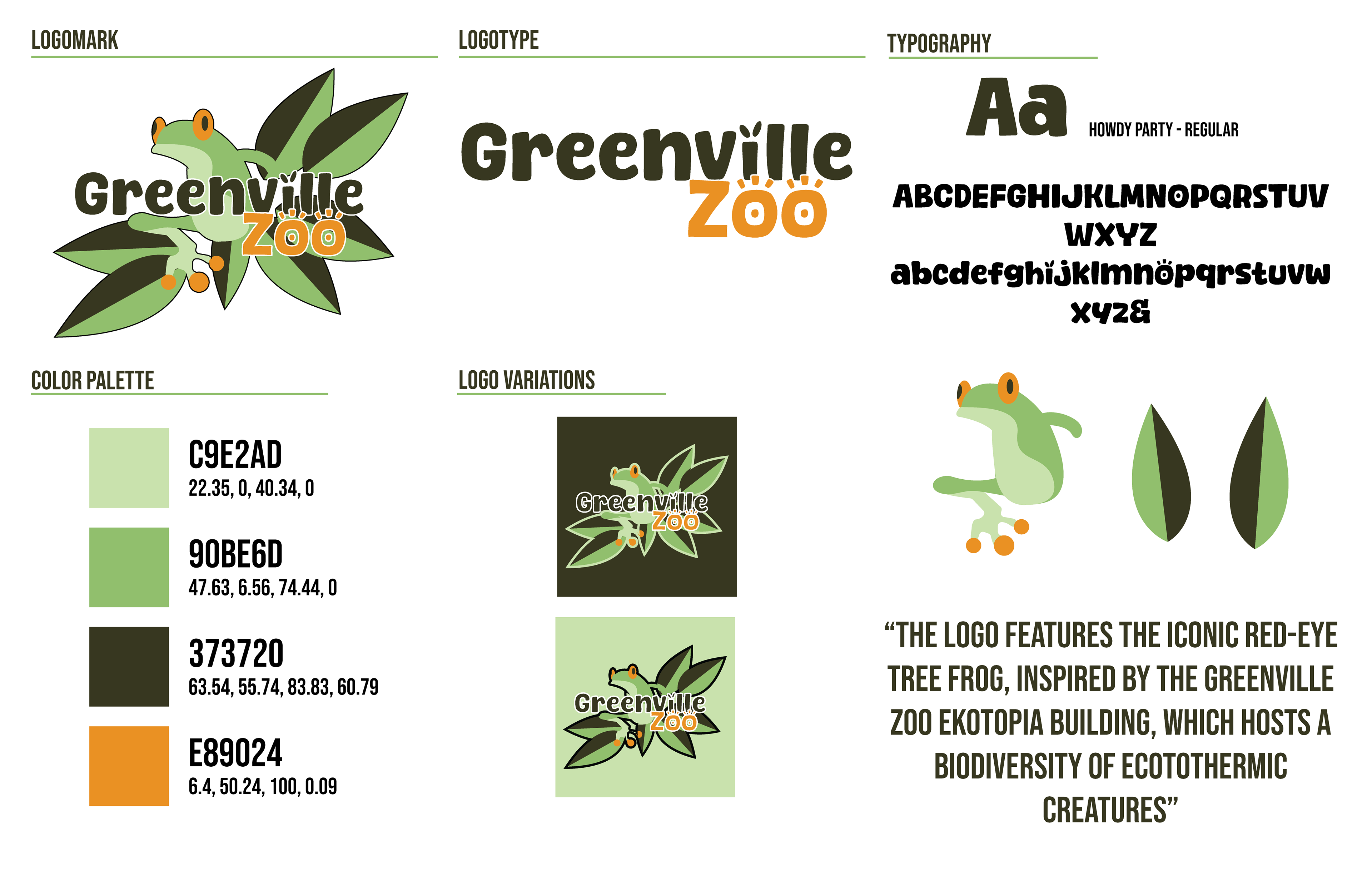
For this project, I developed a new logomark for the Greenville Zoo, aimed towards children and families while mentioning the zoo’s unique features. The logomark color palette is a vibrant mix of yellows and greens, evoking a rainforest feel to reflect the zoo’s diverse animals. The logomark uses a fun, eye-catching font design to immediately capture and convey a family-friendly atmosphere. The centerpiece of the logomark is a Red-Eyed Tree Frog, chosen as the mascot to commemorate the Zoo’s Ekotopia building.
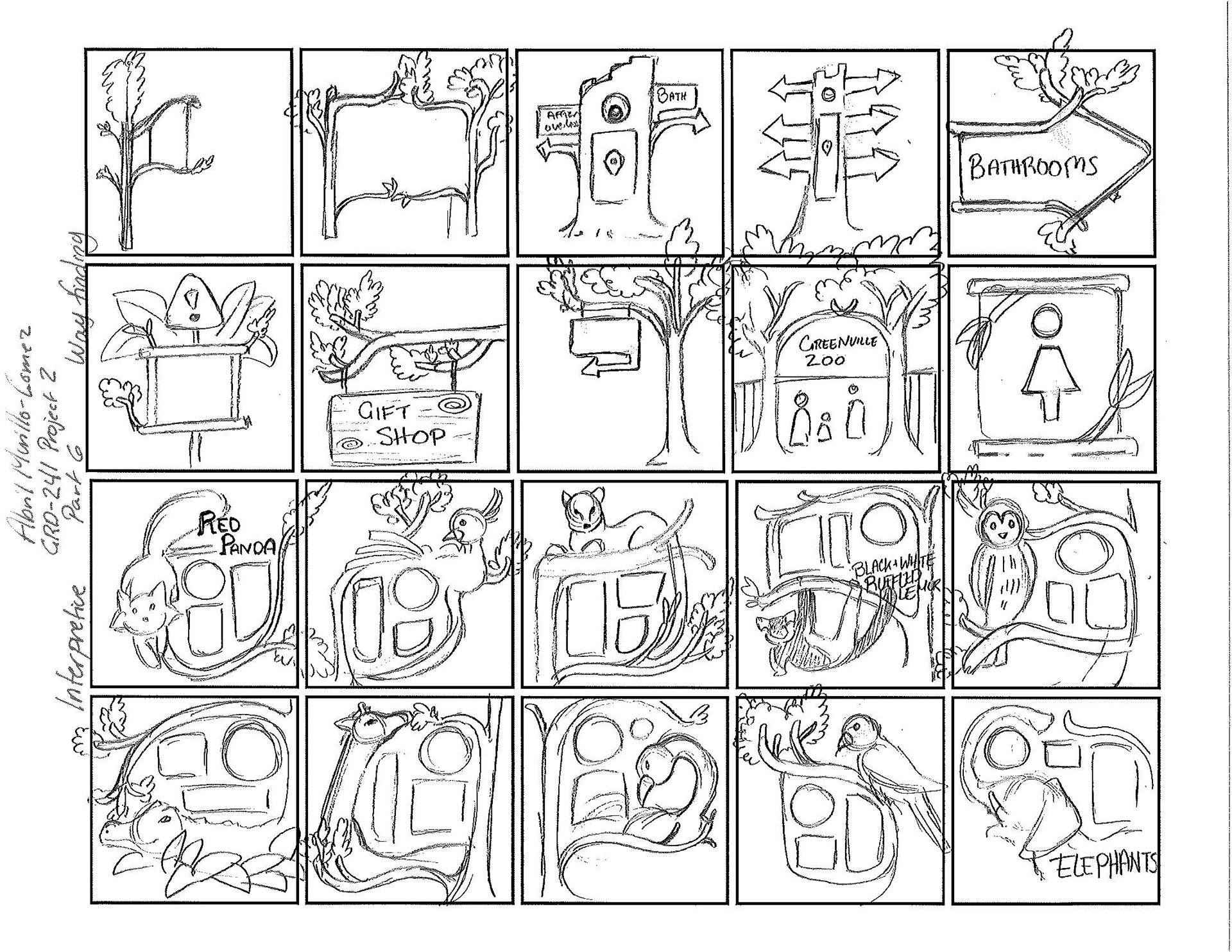
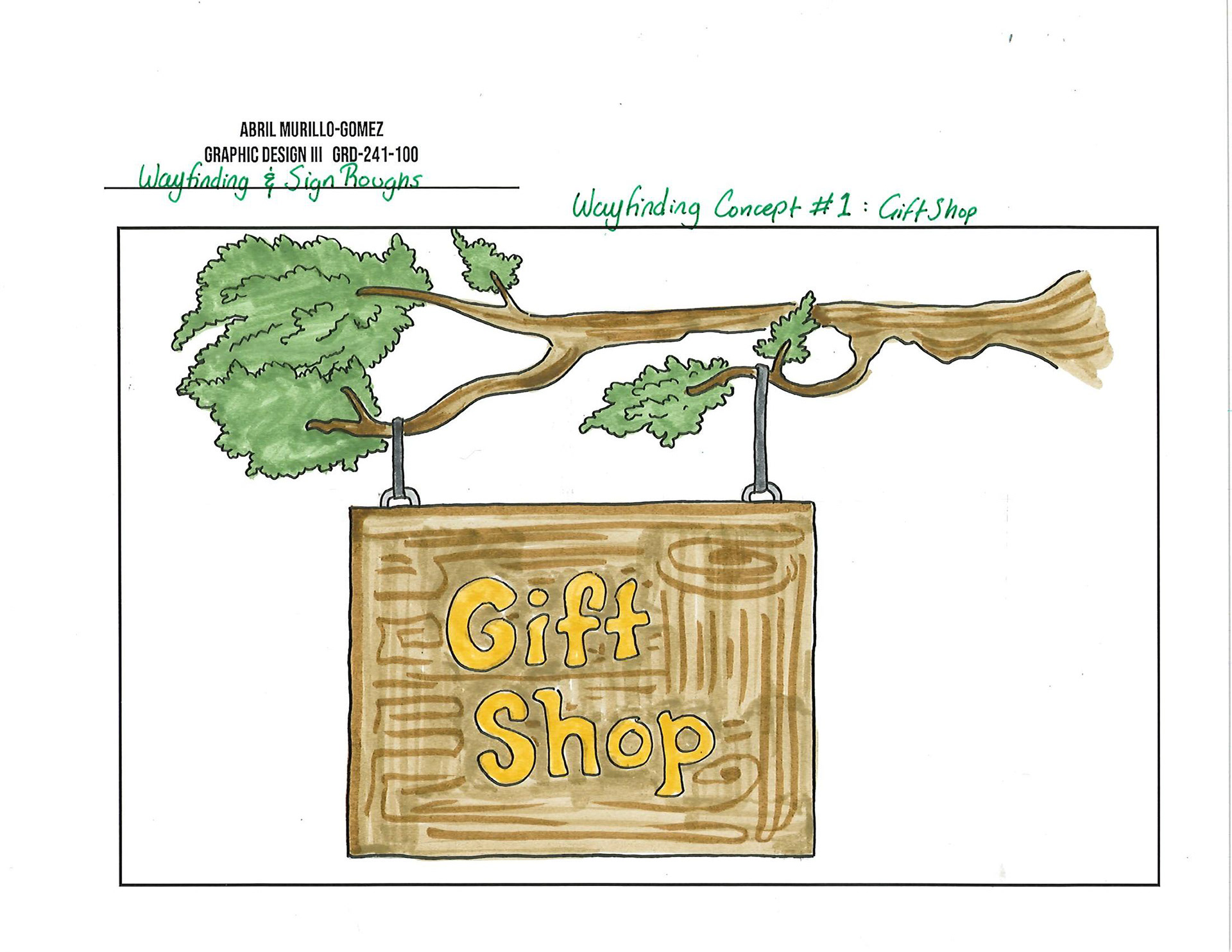
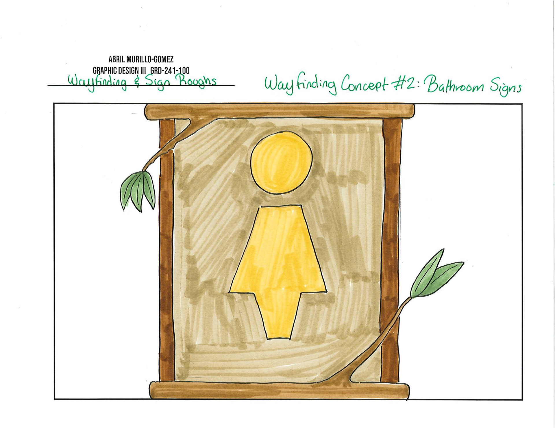
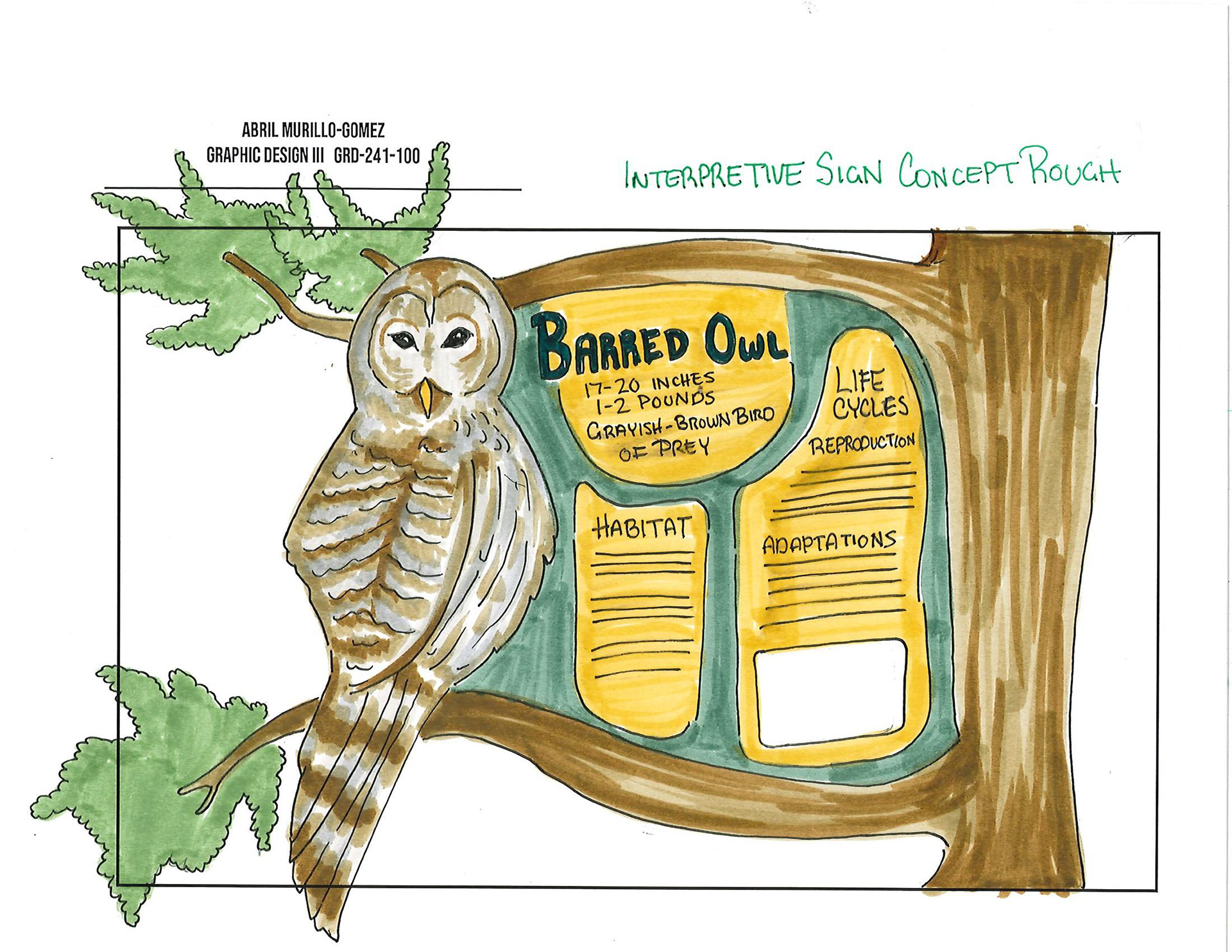
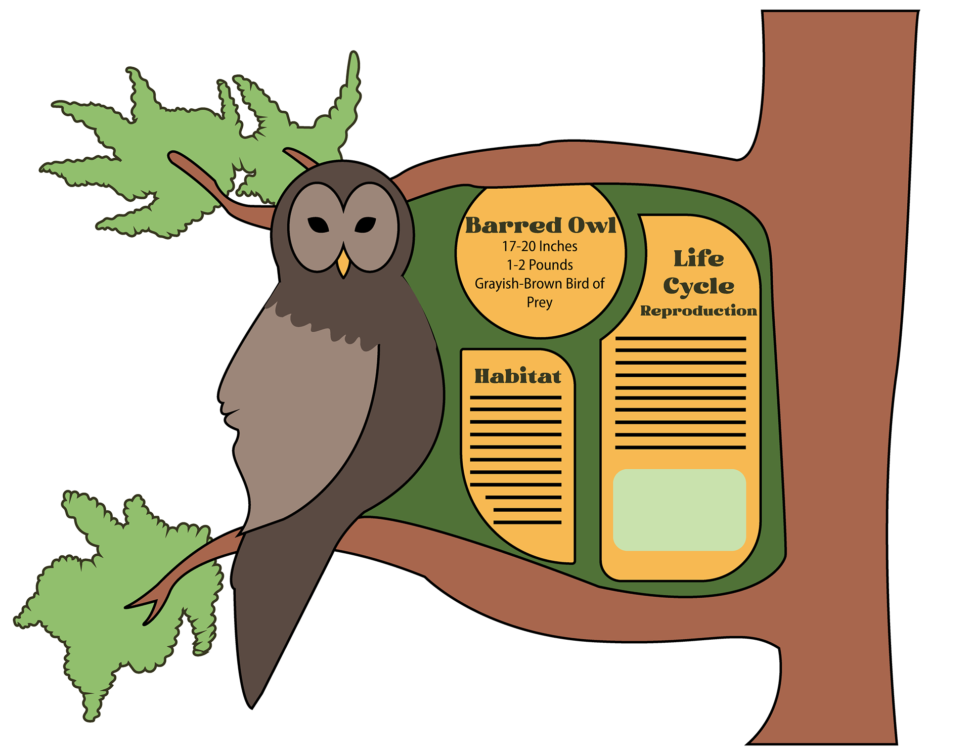
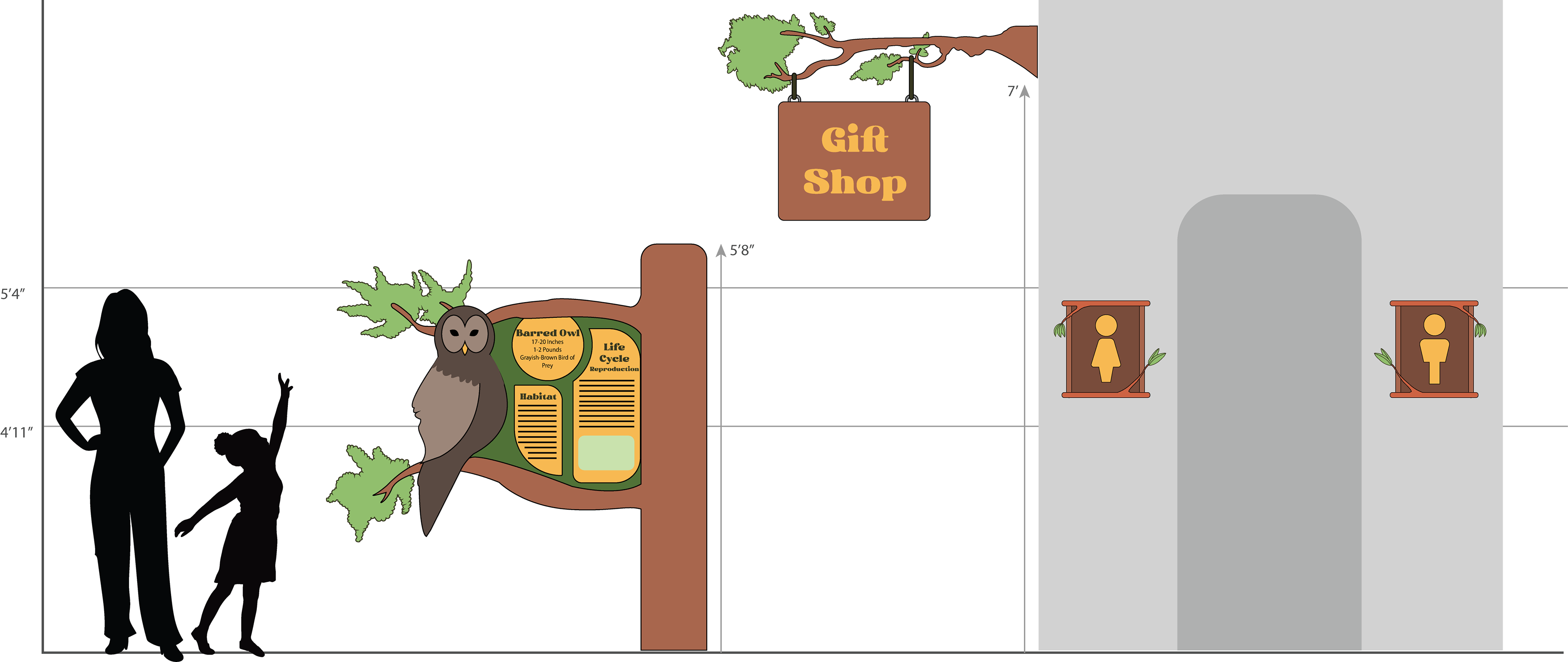
In addition to branding, I designed two child-friendly wayfinding signs styled to resemble natural materials such as wood and branches, reinforcing the zoo’s environmental theme. I also created an interpretive signage panel featuring fun and educational animal facts, with a visual style intended to engage younger visitors and enhance their learning experience throughout the zoo.